DPC Distribuidor - Brasil [2024]
SOBRE O PROJETO
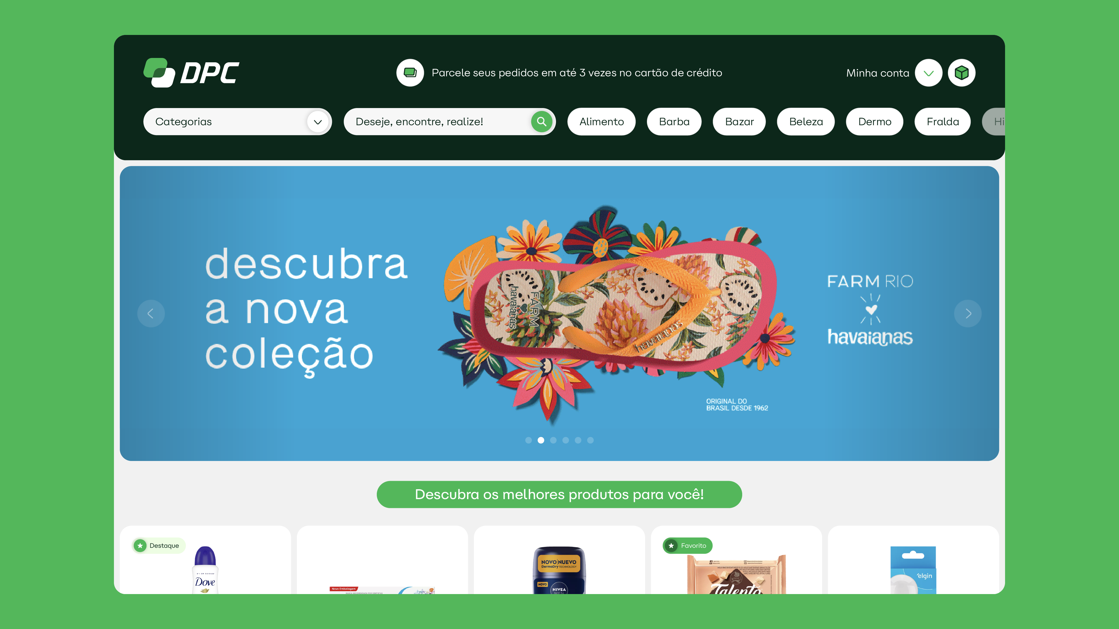
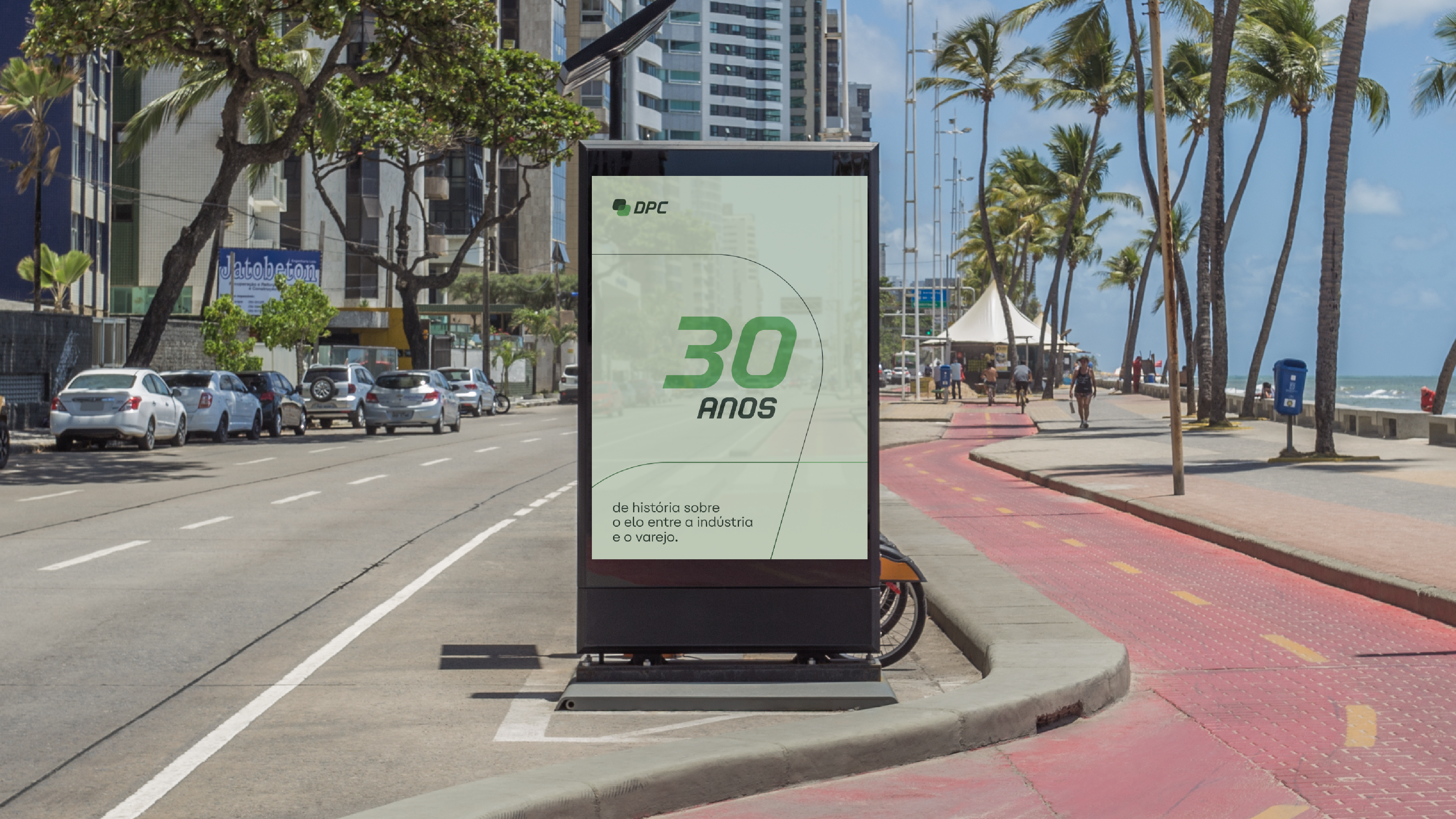
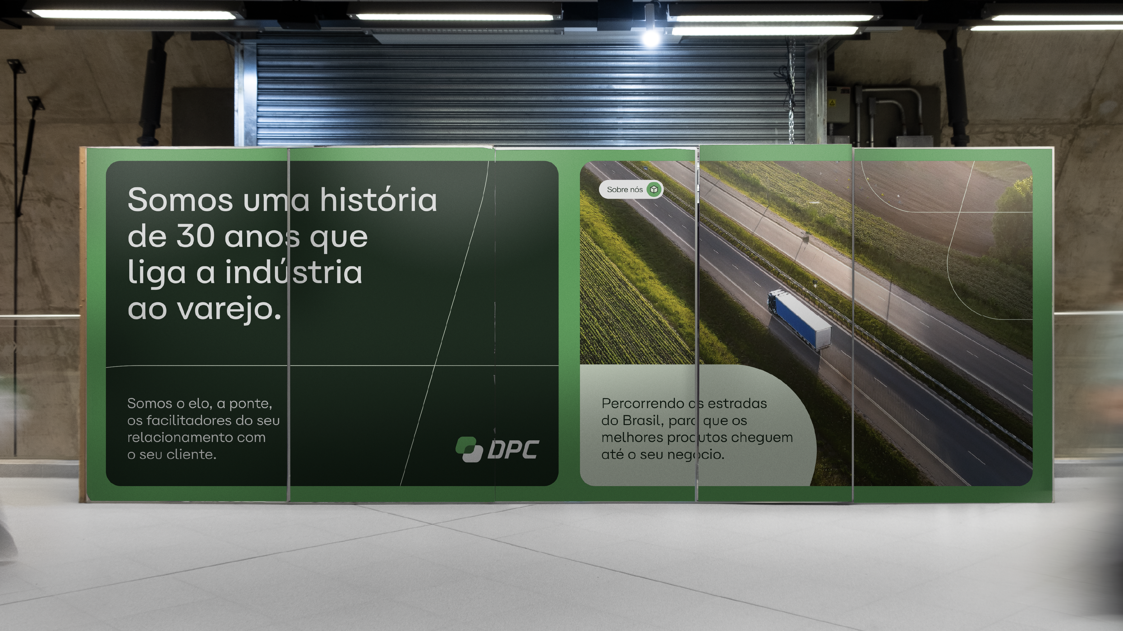
Em abril de 2024, a DPC Distribuidor nos procurou com um desafio único: criar um selo comemorativo que fosse capaz de representar os valores da marca e contar sua trajetória de sucesso. O objetivo inicial era desenvolver uma KV (Key Visual) que transmitisse a essência da empresa, celebrando suas conquistas ao longo dos anos e reafirmando seu compromisso com a qualidade e a inovação.
Durante o processo, após uma série de reuniões e análises, identificamos a necessidade de ir além do selo comemorativo e propor um rebranding. A marca, embora sólida, apresentava alguns pontos que poderiam ser ajustados para refletir melhor o contexto atual da empresa. Assim, a proposta evoluiu para uma reformulação visual que preservasse os traços positivos da DPC Distribuidor e que corrigisse e modernizasse elementos, alinhando-se às novas demandas do mercado.
ABOUT THE PROJECT
In April 2024, DPC Distribuidor approached us with a unique challenge: to create a commemorative seal that would represent the company's values and tell the story of its success. The initial goal was to develop a KV (Key Visual) that would capture the essence of the company, celebrating its achievements over the years and reaffirming its commitment to quality and innovation.
However, during the process, after several meetings and analyses, we identified the need for a rebranding alongside the client. It became clear that a change was necessary, maintaining the positive aspects of the brand while making adjustments that aligned with the company’s current context and market demands.
SOLUÇÕES E RESULTADOS
Após alguns estudos, fizemos uma evolução e refinamento na tipografia, removendo os cortes que existiam anteriormente (que não se adequavam à narrativa da marca, uma empresa feita por pessoas conectadas entre si — do gerente ao estagiário de RH, do CEO ao representante comercial. Reduzimos a inclinação (itálico), mantendo as ideias de eficiência e velocidade de forma mais suave. Também aumentamos a espessura da tipografia, tornando-a mais bold, o que gerou mais impacto — um atributo que se encaixa perfeitamente em uma empresa nacional e importante como a DPC.
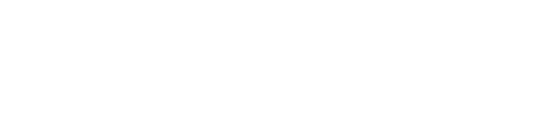
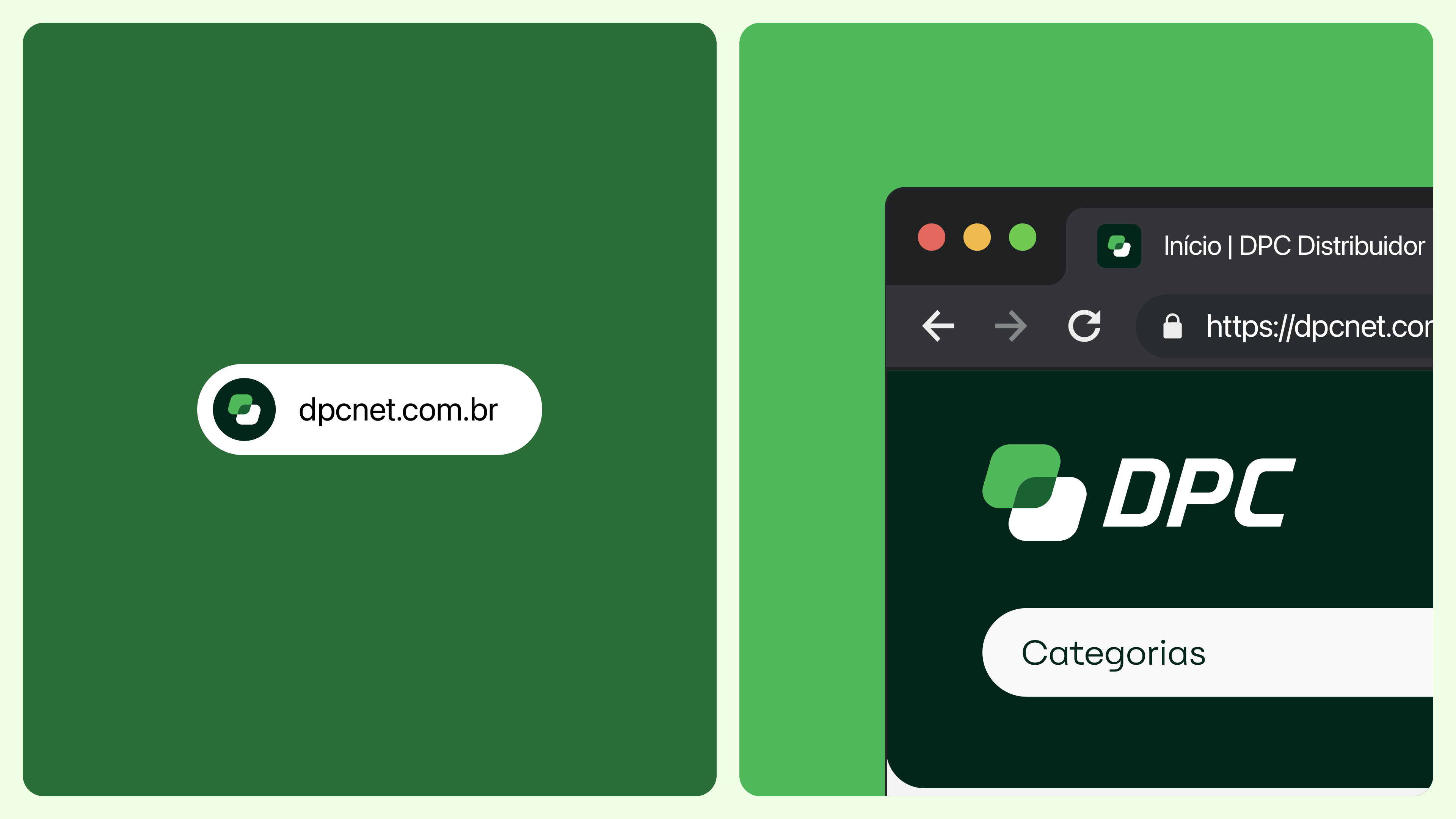
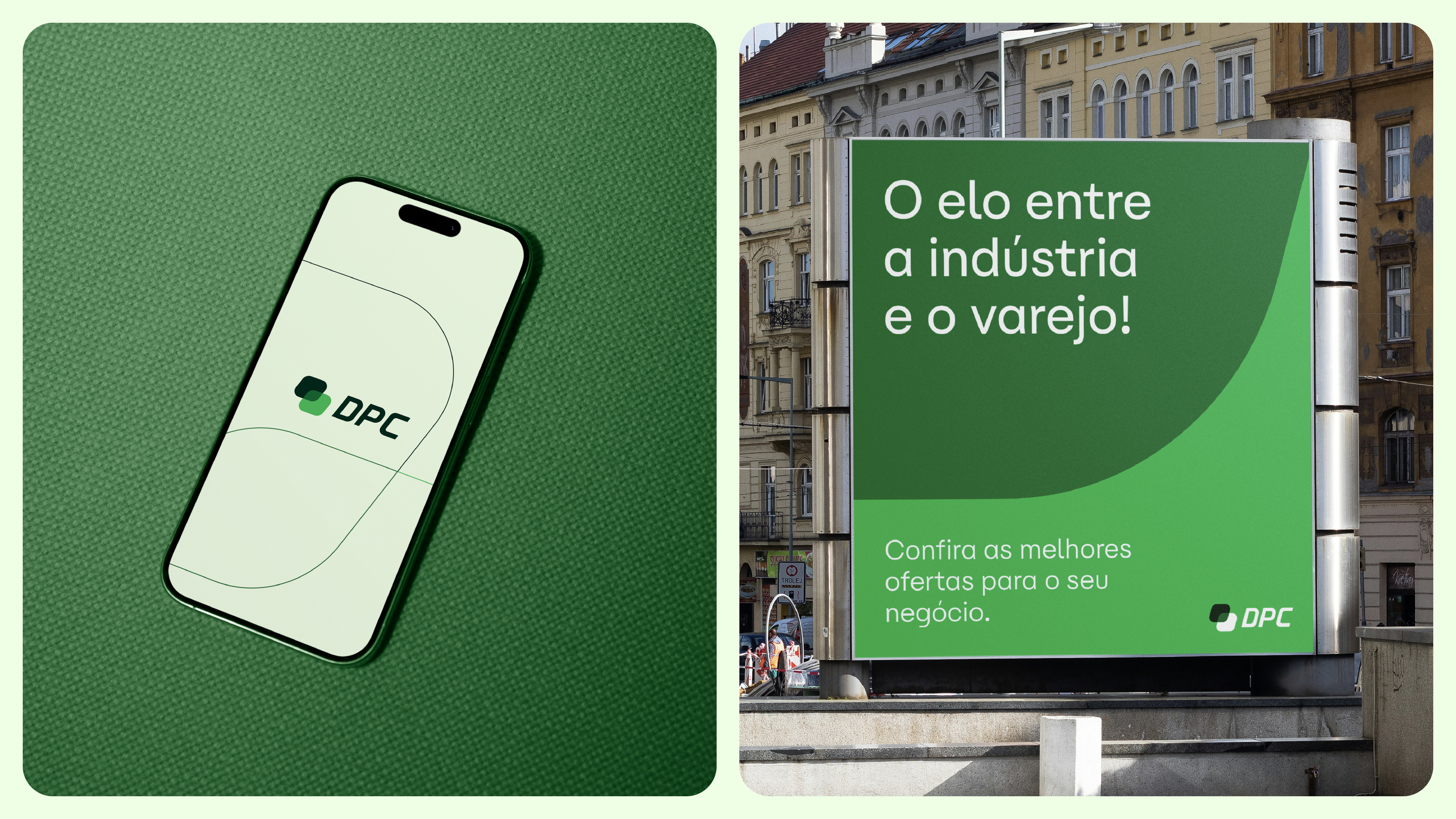
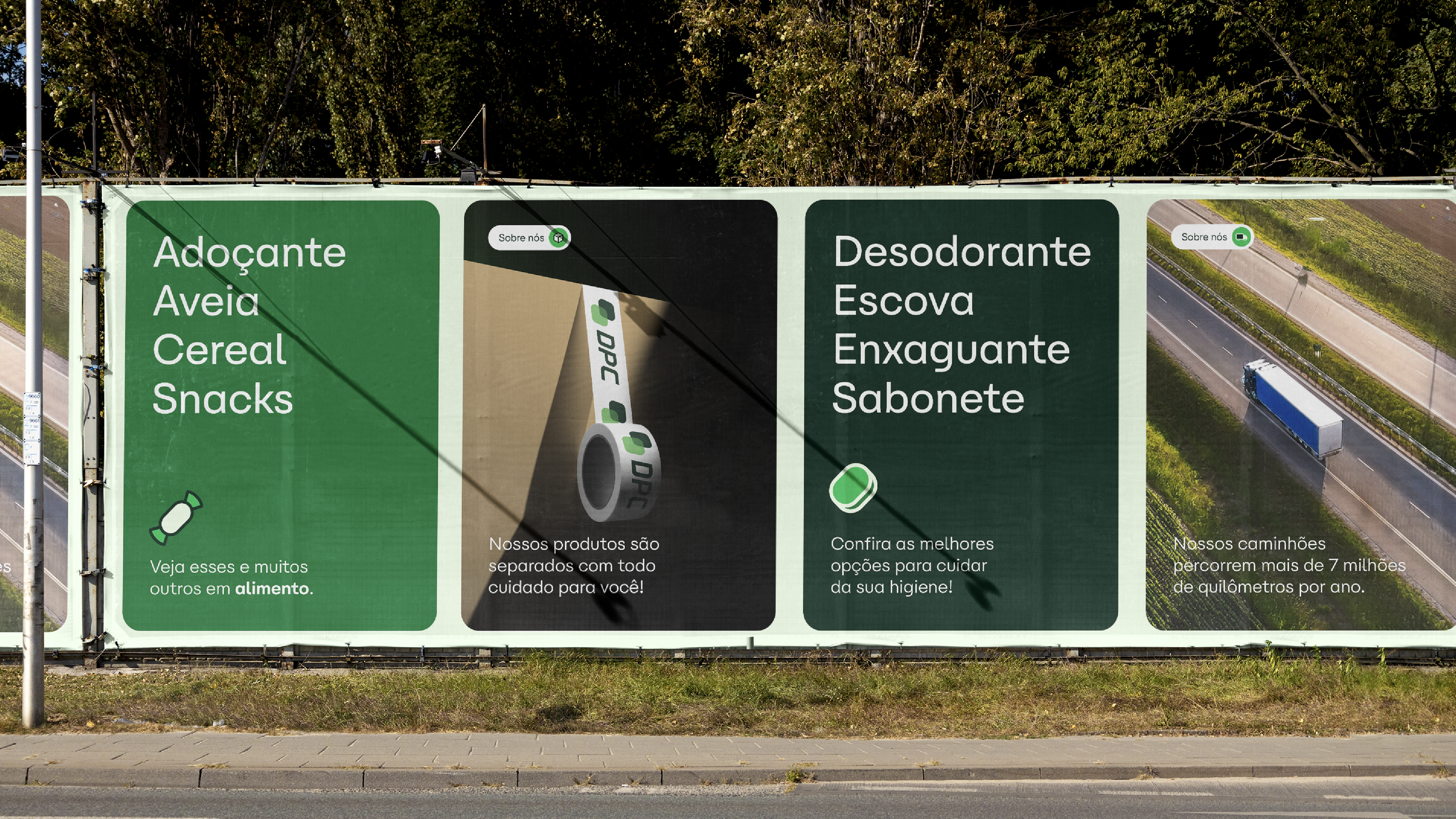
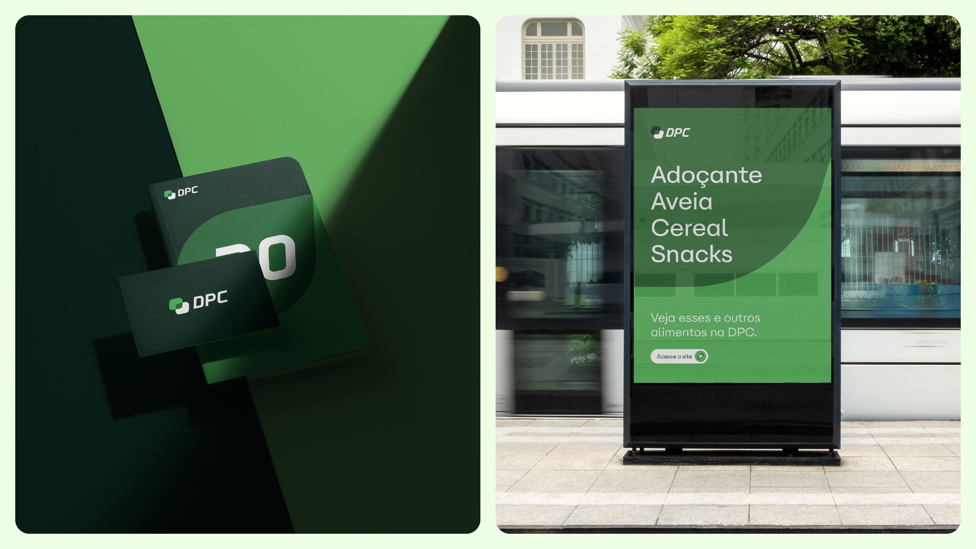
Além disso, criamos um símbolo que, apesar de simples, representa muito bem a empresa. Utilizamos duas caixas com acabamentos em itálico e curvas para transmitir modernidade e atualidade. Tais caixas, quando conectadas, formam um gestalt que simboliza a DPC: uma das caixas representa a indústria e a outra o varejo, com a DPC no centro, atuando como o elo que conecta esses dois mercados. Além disso, essa contraforma cria uma janela, representando a visão da empresa — sempre em busca de se adaptar às necessidades e demandas do mercado, destacando-se e criando tendências.
SOLUTIONS AND RESULTS
After conducting several studies, we evolved and refined the typography, removing the cuts that previously existed (which didn’t align with the brand’s narrative—a company built by people, with connections from the manager to the HR intern, from the CEO to the sales representative). We reduced the italic slant, maintaining the idea of efficiency and speed, but making it lighter. We also enhanced the thickness of the typography, making it bolder and creating a greater impact—an attribute that fits well for a large, national, and important company like DPC.
In addition, we created a symbol that, although simple, represents the company well. We used two boxes with italic and curved finishes to convey modernity and contemporaneity. These boxes, when connected, form a gestalt that represents DPC: one box represents the industry, and the other represents retail, with DPC positioned at the center, acting as the link that bridges these two markets. Furthermore, this counterform is also a window, symbolizing the company's vision—one that always seeks to adapt to market needs and demands, constantly standing out and setting trends.
Follow: D/Design Studio™
ABOUT / TEAM
Service: Rebranding / 30 Years Subscription / Year: 2024 / Client: DPC Distribuidor
Direction: Damião Giovani / Strategy: Rogério Bitencourt (DPC TEAM)
Concept: Damião Giovani / Design: Damião Giovani / Motion: Adriano M.
Logotype Refinement: Arthur Felippe / Verbal Identity: Guilherme Sampaio
© All rights reserved to D/Design Studio™ and DPC Distribuidor.